

ROUZATI JOURNAL / THE LIVING ROOM EDIT
How To Refresh A Neutral Living Room With A Red Persian Rug
Keep the sofa.
Change the conversation.
A practical decorating guide to one expressive rug, a few considered accents and the room you already own.
THE QUICK ANSWER
Let the rug make the first move.
A red Persian rug can give a neutral living room a clear visual center without requiring new upholstery or a different wall color. Start with the furniture you want to keep. Choose a rug whose red, lighter details and border work beside those existing surfaces, then repeat one small accent and check the layout before adding anything else.
The useful change is specific: one rug, one linking accent and a measured furniture plan. You do not need red curtains, red artwork and red cushions to make the rug belong.
The two catalog examples below put red across much of the rug, including the warm-toned outer areas, so each reads as a red rug from the doorway. One is quieter and more tonal; the other shows more distinct pattern. Use the originals to compare actual catalog views; the room concepts show styling possibilities. Confirm current dimensions, color and condition for the exact piece.
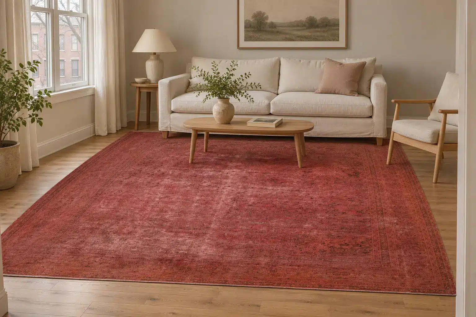
AI ROOM-STYLING CONCEPT · Approximate visualization based on the exact catalog reference, targeting its 113 × 150-inch footprint beside a hypothetical 84 × 36-inch sofa. Use the original catalog photograph for the actual design; this scene does not confirm color, condition or fit.
01 / TONAL BRICK RED
Outgoing Overdyed - Vintage Distressed Persian Mashad Rug - 9'5" x 12'6" ft.
CATALOG SKU 103247
The seller lists 9′5″ × 12′6″, or 113 × 150 inches. In the original full view, warm brick and coral reds continue from the field into the outer bands. The faint pattern shows through the color, and parts of the field read lighter in this photograph.
Try this direction with: an ivory sofa, light oak and one warm clay cushion. The red can span the whole seating area while the curtain and upholstery stay quiet.
The seller describes this Mashad rug as overdyed and distressed. Ask what is known about the treatment and present condition; the lighter marks in a photograph do not identify their cause.
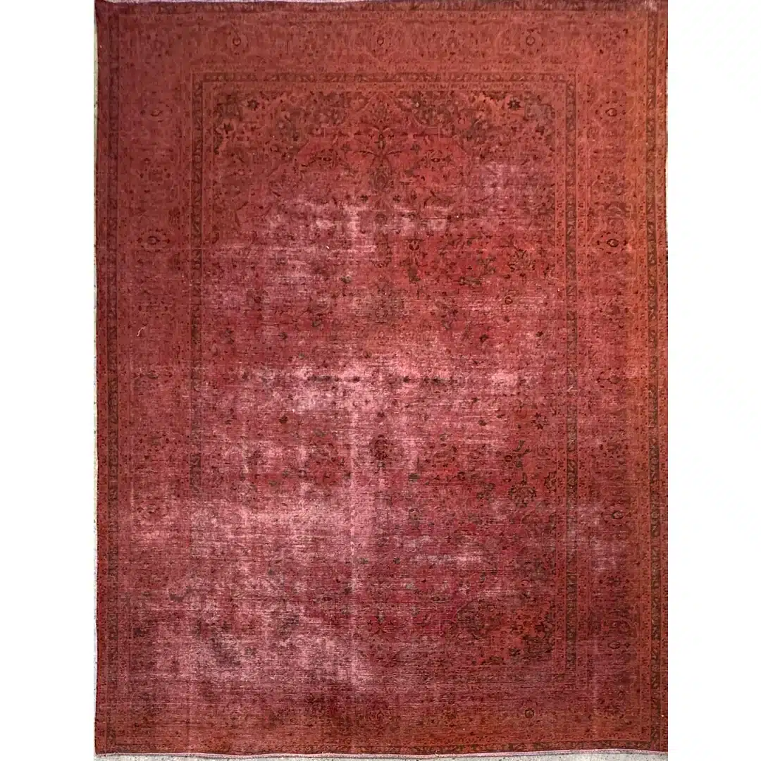
Original full-rug catalog photograph. Open the image or button for the exact product listing.
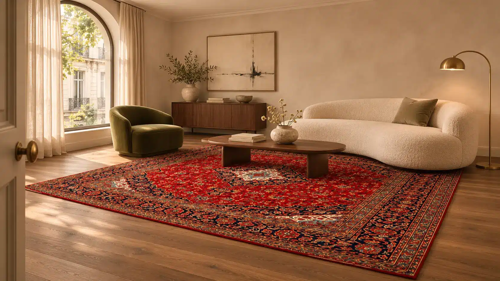
AI ROOM-STYLING CONCEPT · Approximate visualization based on the exact catalog reference, targeting its 96 × 127-inch footprint beside a hypothetical 84 × 36-inch sofa. Use the original catalog photograph for the actual design; this scene does not confirm color, condition or fit.
02 / DEEP CRIMSON WITH DARK DETAIL
Captivating Crimson – Vintage Distressed Persian Rug – 8' x 10'7" ft.
CATALOG SKU 108399
The seller lists 8′ × 10′7″, or 96 × 127 inches. The original photo shows a deep crimson field and red-brown bands with a darker medallion, corners and outlining. There is still clear contrast within the red composition.
Try this direction with: cream upholstery and one small burgundy accent, or the dark wood you already have. Leave the main fabrics plain to let the rug’s drawing come forward.
The seller describes this as a vintage distressed Persian rug. Confirm current measurements, colors and condition for this exact piece before deciding.
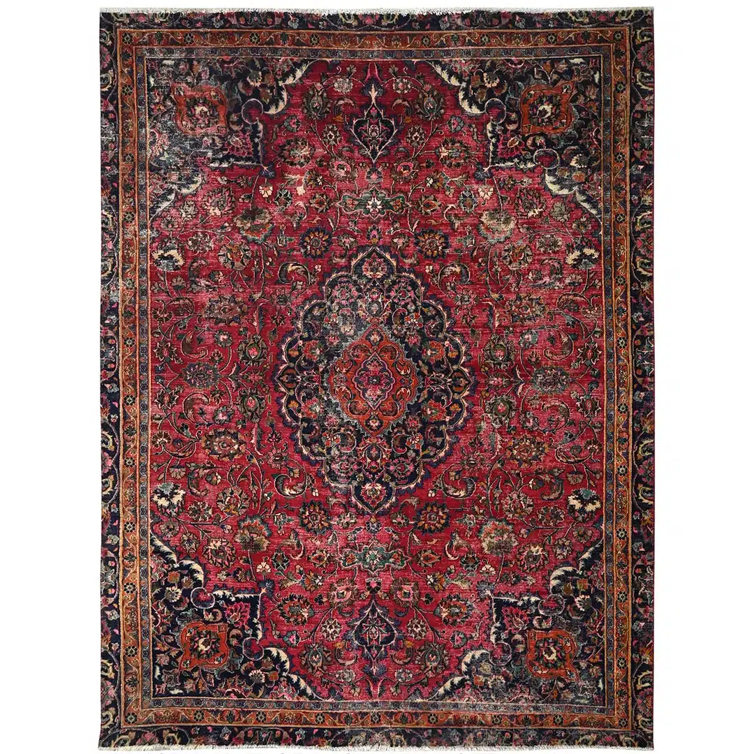
Original full-rug catalog photograph. Open the image or button for the exact product listing.
01 / KEEP THE FOUNDATION
Start with what is staying.
Take a photograph from the doorway and list the room’s largest existing surfaces: sofa, walls, floor, curtains and any large cabinet. Describe what you actually see. An ivory sofa against warm oak offers a different setting from a gray sofa against a dark floor, even though both rooms might be called neutral.
Choose the change you want the rug to make. Perhaps the room needs a stronger seating-area focal point, more visible pattern or a connection between warm wood and cooler upholstery. That single aim makes the shortlist more useful than a search for a supposedly universal shade of red.
Keep the furniture arrangement and accessories unchanged for the first comparison. If you replace the lamps, curtains and cushions at the same time, it becomes harder to tell which choice helped. A room refresh can begin with editing what is already there: move a competing throw or clear an overly busy table before buying another object.
02 / READ THE WHOLE PALETTE
Red is only part of the rug.
Look at the red field, then examine the lighter and darker drawing separately. A pale border may connect to cream upholstery; a blue-gray detail may give a cooler sofa a point of contact; a dark outline may relate to an existing picture frame. These are observations to test in the specific room, not fixed color-pairing laws.
The Metropolitan Museum of Art explains Josef Albers’s Homage to the Square series as an exploration of how neighboring colors affect their appearance. A useful decorating inference is to compare the rug beside your own upholstery and floor, rather than selecting it against an isolated white screen.
Compare the relationship, not just the red. Save a view of the entire rug with a photograph of your room. Note which light detail connects to the sofa and which dark detail remains visible from the doorway. A small motif that disappears at that distance may be a poor starting point for the room’s main accent.
THE ROOM-REFRESH COMPARISON
Choose the emphasis you want to live with.
| Room decision | Tonal brick red · 103247 | Patterned crimson · 108399 |
|---|---|---|
| What you see in the photo | Brick and coral reds extend through the field and border, with a faint underlying drawing. | A deep crimson field with darker medallion, corners and edging. |
| Existing sofa to test | Cream or warm oatmeal, using the original view for comparison. | Ivory or gray, comparing the actual red against your upholstery. |
| One accent to try | A small clay cushion or warm oak already in the room. | One burgundy cushion or an existing dark wood frame. |
| Pattern check | Check where the tonal variation remains visible outside the coffee table footprint. | Check how much of the medallion or dark border remains visible when the table is in place. |
| Catalog dimensions | 113 × 150 inches. | 96 × 127 inches. |
| Still to verify | Current color, condition and the seller’s description of the finish. | Current color, condition and the seller’s description of the finish. |
03 / REPEAT A SMALL DETAIL
One connection is enough to begin.
Choose a secondary color that is visible in the rug and already comfortable beside the furniture. Repeat it in one modest object: a cushion, a ceramic piece or a throw you own. The repeat need not match exactly or occupy the same amount of space as it does in the rug.
If you prefer a quieter result, repeat a cream or blue-gray detail instead of the red itself. If you want the red to feel more deliberate, try one small related rust or red accent and stop there for the first viewing. Look again from the doorway before deciding that another repeat is needed.
Texture can create interest while leaving the palette alone. Compare the rug with plain linen, a woven basket or a wood table already in the room. These are options to assess, not a shopping list. There is no required percentage of red and no need to make every accessory refer to the rug.
04 / GET THE FOOTPRINT RIGHT
Measure the seating group before choosing the picture.
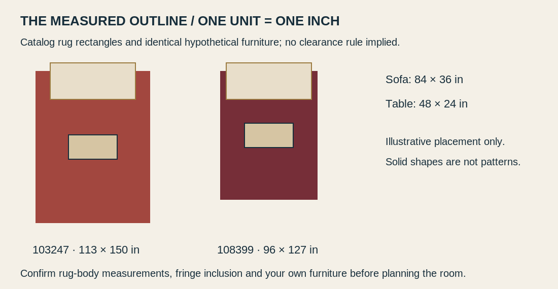
The red rug footprints are 113 × 150 inches and 96 × 127 inches, measured as width by length. In the diagram the same 84-inch sofa is centered along the width of each rug and the same 48 × 24-inch table is marked on both. Replacing the drawn furniture with your actual measurements is the useful next step; the illustration does not prescribe how much rug should extend on either side.
Measure the outside dimensions of your sofa and table, the intended rug area and the routes through the room. Mark the proposed outline on a paper plan, keeping doors, nearby furniture and fringe inclusion in mind. Decide deliberately whether sofa feet will overlap the rug and how much patterned surface you want left exposed.
A solid coffee table may cover the central medallion that attracted you. Check the surrounding field and border as well. Our guide to medallions and furniture coverage helps you evaluate that separate composition decision. The numerical diagram above preserves catalog dimensions; it does not certify the scale or fit of the AI scenes.
05 / LOOK IN YOUR USUAL LIGHT
Make the final color comparison in context.
The National Gallery of Art’s color teaching material describes color as the light reflected from objects and distinguishes that from a screen’s emitted RGB light. For shopping, the practical implication is modest: a screen image is a useful reference, but it cannot settle an exact match to your sofa or paint.
Ask for consistent-light photographs and compare the available views. Look at your room in daylight and under the lamps you normally use, using an actual viewing opportunity if the seller makes one available. Avoid treating a highly edited photograph or the AI concepts here as color evidence.
Also consider viewing direction. A pile rug can read differently from opposite ends; our pile-direction color guide explains the observation. A paler view alone does not diagnose fading, wear or a deliberate treatment.
THE FIVE-STEP EDIT
Refresh the room in a manageable order.
- Keep the foundation: photograph the sofa, wall and floor you are retaining.
- Compare two rug references: choose the field, border and visible pattern you prefer.
- Draw the outline: use confirmed rug-body and furniture dimensions.
- Try one linking accent: use a secondary color or a small red detail already in the rug.
- Review the real room: check the doorway view, seated view and everyday lighting before adding more.
When comparing persian rugs for sale, save the exact product ID with your palette and measurement notes. If a different composition is a better match, browse turkish rugs for sale with the same visual checklist, while keeping country of weaving separate from design style.
For a broader starting point, explore oriental rugs in Chicago at Rouzati Rugs, then return to an individual listing for the details that determine your choice. Ask about materials, current condition, repairs, treatments and suitable use, and confirm purchase terms directly. The online antique-rug photo checklist can help organize those requests.
FAQ / A RED RUG IN A NEUTRAL ROOM
Questions before you refresh
Does a red Persian rug work with a gray sofa?
It can. Compare the exact rug’s light and dark details with your sofa, floor and walls. A blue-gray detail may offer a connection, but there is no universal red that suits every gray upholstery.
Do I need to paint the walls or replace the curtains?
Start with the existing neutral surfaces. Place the rug reference beside them and assess the relationship before changing another large element. A small accent or simpler table styling may be enough for the refresh you want.
Should I match the cushions to the red field?
You can, but it is optional. Try one small related red accent, or repeat a cream, blue-gray or dark detail from the rug instead. Judge it from the doorway rather than aiming for an exact screen-color match.
Is a distressed red rug always the quieter choice?
No. Distressed is a seller description to clarify, not a reliable measure of visual emphasis or current condition. Compare the exact field, border and contrast, then ask how the appearance developed.
How large should the rug be for my sofa?
Use the actual seating group, table, available floor area and circulation routes. The two examples are 113 × 150 and 96 × 127 inches; neither dimension is a universal recommendation. Confirm body dimensions and fringe inclusion before making your plan.
Are the room pictures real installations with exact scale?
No. They are labelled AI concepts based on the exact references and target proportions. The original product photos show the catalog pieces, while the separate numerical schematic provides exact rectangle arithmetic. Confirm color, condition and fit independently.
THE FINISHING TOUCH
Let one considered change be enough.
Keep the room’s useful pieces and give the rug a clear role. A measured footprint, a visible color connection and a restrained first edit will tell you more than a cart full of matching accessories. Choose the exact rug you enjoy beside your actual furniture, then let the room develop around it.