

ROUZATI JOURNAL / CONNECTED ROOMS / 01
Mixing Turkish and Persian Rugs in Connected Rooms: What to Repeat and What to Vary
THE PAIRING NOTEBOOK
Different rooms.
Different rugs.
One visual conversation.
Start with the view through the doorway, then give each room its own composition.
Can you mix Turkish and Persian rugs?
Yes. When mixing Turkish and Persian rugs in connected rooms, choose a visible relationship—such as a repeated blue, warm red or pale border—and allow another feature to differ. Compare the actual rugs from the sightline where both rooms meet. Their country labels do not need to match, and those labels alone cannot tell you whether two designs will work together.
Repeat a connection. Vary the emphasis. One shared color can link two rooms while a different field, motif spacing or rug size gives each room a distinct role.
The choices below are practical decorating judgments, not fixed rules. The dimensions and product descriptions are seller statements; the pattern observations come from original Rouzati catalog photographs.
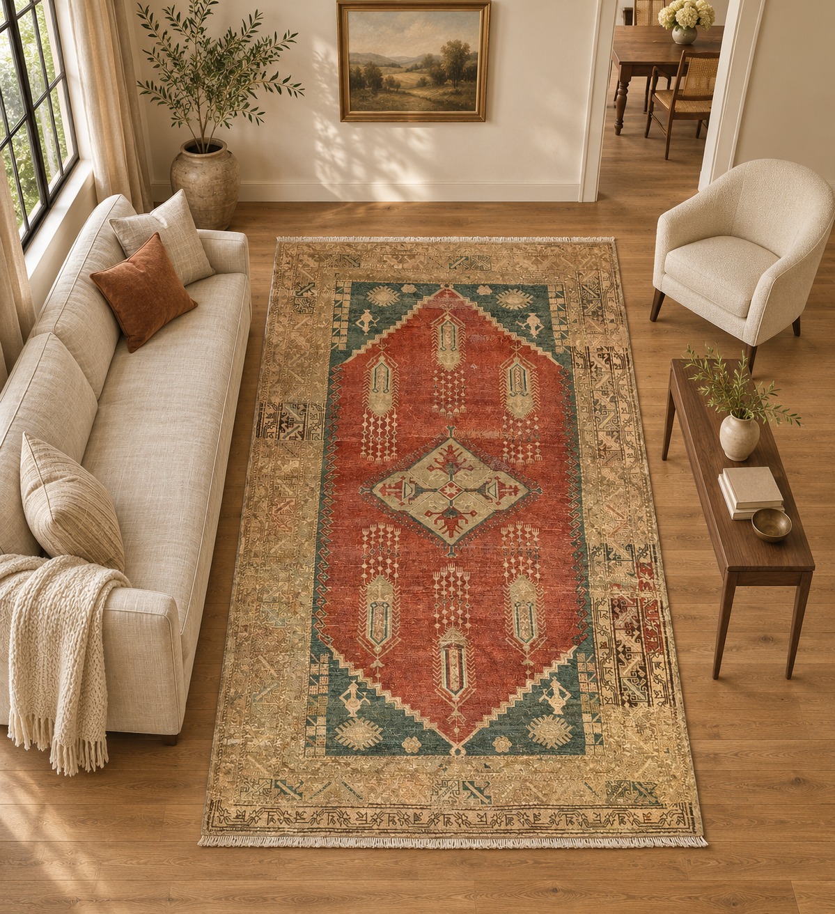
AI ROOM-STYLING CONCEPT · Based on this exact catalog reference and its stated proportions. Approximate visualization, not a real installation, exact reproduction, condition record or measured fit. Use the original photo for product details and the schematic for scale.
A / THE SITTING AREA
Rustic Radiance – Vintage Anatolian Oushak Area Rug – 5'7" x 9'0" ft.
CATALOG SKU 106650
The catalog identifies this as a vintage Anatolian Oushak area rug at 5′7″ × 9′0″, or 67 × 108 inches. In the original photograph, a rust-red field surrounds a pale diamond and widely spaced hanging forms; blue-green corner areas sit inside a tan patterned border.
Its proposed role: the more open composition in a compact sitting area. Use its blue-green details as a possible bridge to the next room, rather than trying to repeat every red shape.
The open rust intervals are useful to compare with the denser Malayer field. This is a reading of these two photographs, not a rule that Turkish rugs are always open or Persian rugs always dense.
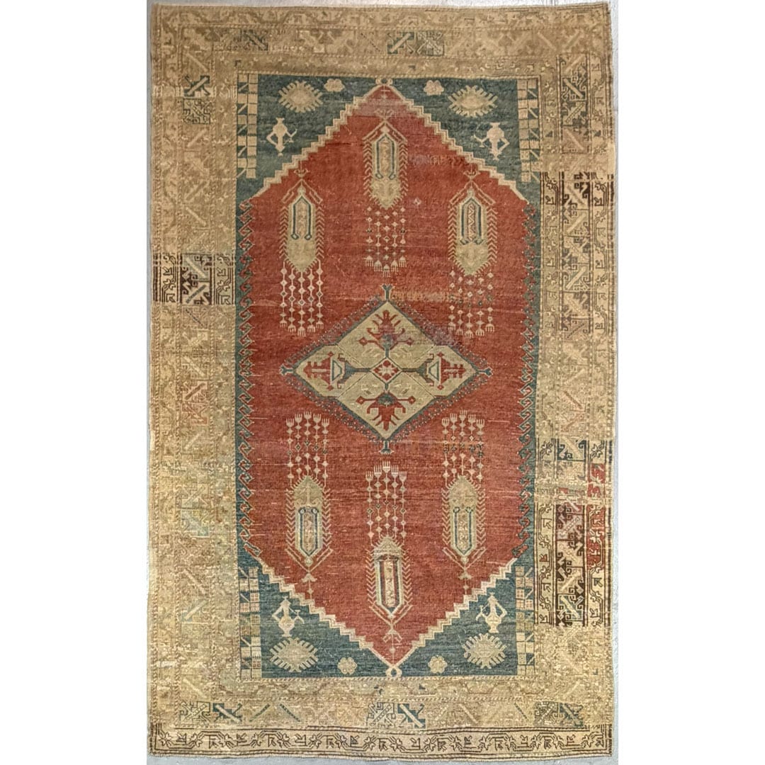
Original catalog reference. Click either image or the button for this exact listing.
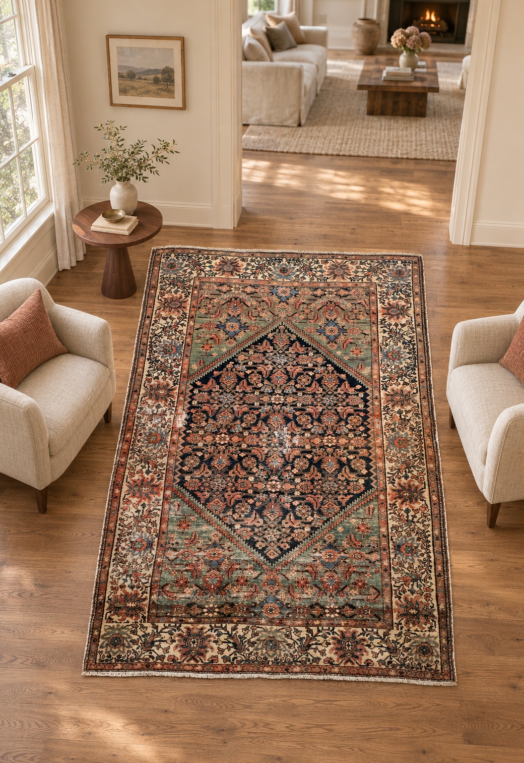
AI ROOM-STYLING CONCEPT · Based on this exact catalog reference and its stated proportions. Approximate visualization, not a real installation, exact reproduction, condition record or measured fit. Use the original photo for product details and the schematic for scale.
B / THE READING AREA
Miraculous Malayer - 1930s Antique Persian Rug - Herati Design - 4'9" x 6'11" ft.
CATALOG SKU 104584
The catalog calls this a 1930s antique Persian rug with a Herati design, measuring 4′9″ × 6′11″, or 57 × 83 inches. The original view shows a dark diamond-shaped field filled with smaller floral forms, muted green corner areas and a pale floral border.
Its proposed role: a separate reading area, where the closer pattern and dark field can create a different visual emphasis. Compare its muted green and rust details with the Oushak’s accents.
The smaller footprint gives this rug a different job in the example. It is not a size-matched substitute for the first rug, and its catalog age or design label has not been independently authenticated.
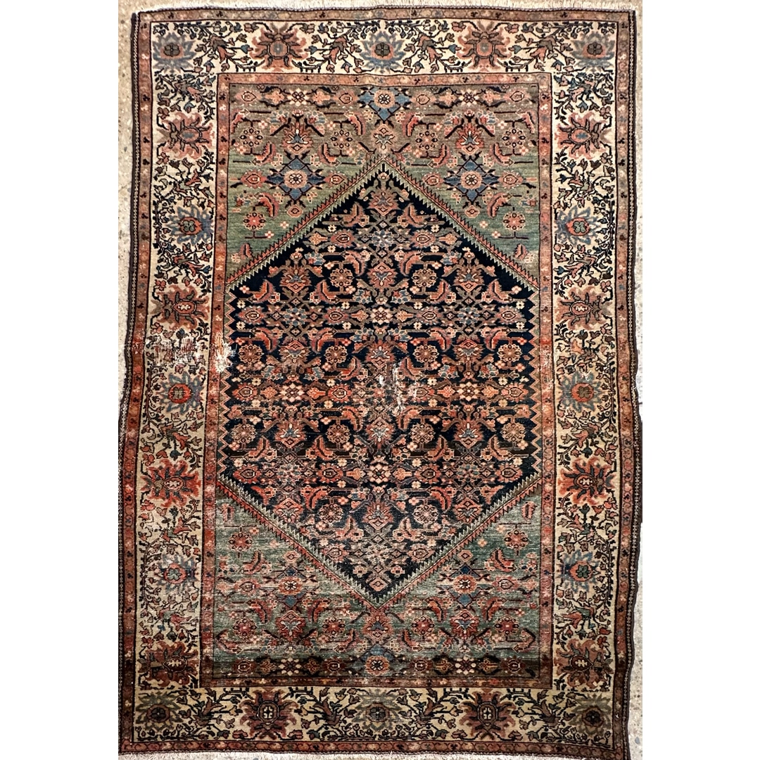
Original catalog reference. Click either image or the button for this exact listing.
PROPORTIONS BEFORE PICTURES
Two footprints. Two jobs.
The larger catalog rug is 67 × 108 inches; the smaller is 57 × 83 inches. The schematic draws those rectangles at one common scale. It also includes hypothetical rooms and furniture, so the difference remains visible rather than disappearing into equally sized image boxes.
A room photograph can help you imagine a mood. It cannot confirm a clearance, the size of a chair or how much fringe belongs inside a listed measurement. Before choosing, confirm the current rug-body dimensions and make a plan of your own spaces.
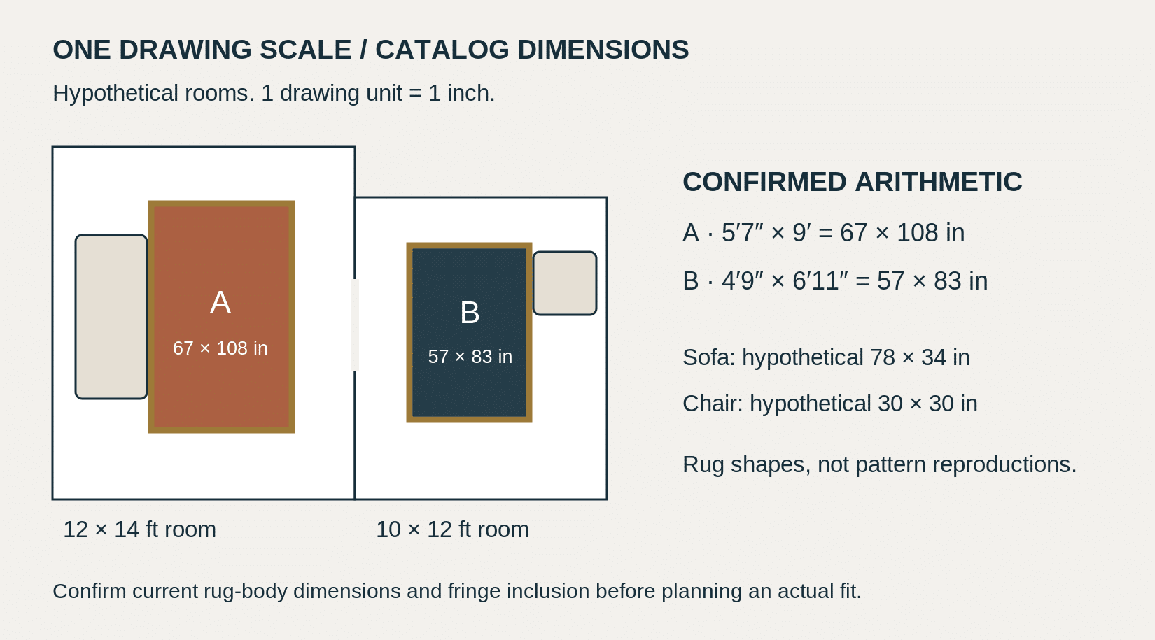
SCHEMATIC · Exact arithmetic from catalog-stated dimensions. Hypothetical rooms, sofa and chair; not a measured plan of either AI scene. On a narrow screen the drawing remains proportionate; the dimensions are repeated in the text above.
01 / REPEAT
Choose one thread that crosses the doorway.
Begin with a feature you can see from the connecting space. In this pair, muted blue-green and warm rust are candidates: one rug gives rust more of the field, while the other places warm details inside a dark central area. The relationship does not require equal amounts of either color.
Compare those accents against the actual floor, walls and upholstery. A tan border beside pale oak may merge more than it does beside dark stained boards. If the rooms already share a wall color and wood finish, the rugs may need only a small additional connection.
Keep the original images beside each other at a comparable exposure, and request consistent-light photographs if color is decisive. Neither a phone screen nor an AI styling scene is an exact color sample. Test what the seller can show you before treating two blues as a match.
A USEFUL PAIRING SENTENCE
“Repeat the muted green.
Change the field.”
Write one sentence about your intended relationship. If it names every color, motif and border, simplify the test.
02 / VARY
Give each room its own emphasis.
Once you have a connection, choose the difference deliberately. You might pair an open field with a closer repeat, a lighter field with a darker one, or a large seating-area rug with a smaller reading-area piece. Change the feature that helps the room; there is no required number of contrasts.
For the two catalog views here, the clearest difference is the amount of space between motifs. Rustic Radiance has larger rust intervals around its hanging forms. Miraculous Malayer carries smaller repeated forms through much of its dark diamond. That comparison concerns these photographs, not every Oushak or Herati design.
The Metropolitan Museum of Art’s family guide encourages looking at repeated shapes and colors from farther away, then examining smaller details and the border. That observation method is useful here: a fine repeat that looks active close up may read as a more unified field through a doorway. Judge it from the distance you actually use.
If furniture covers the main motif, compare the remaining pattern first. Our medallion and allover guide walks through that separate furniture-coverage decision.
THE COMPARISON SHEET
What to repeat—and what to leave different.
| Decision | Repeat across the rooms | Allow to differ | Test from the doorway |
|---|---|---|---|
| Color | One visible accent or border tone. | Which color occupies most of each field. | Can you identify the shared tone without zooming into a photo? |
| Pattern rhythm | A related shape, line or floral detail if you enjoy it. | Open intervals versus a closer repeat. | Does each composition remain readable beside the other? |
| Visual emphasis | A shared level of warmth or a linking neutral. | A rust field in one zone and a dark diamond in another. | Does one rug draw attention where you want the focal area? |
| Footprint | A consistent relationship to each room’s furniture. | Actual width and length to suit each zone. | Are the edges and the route between rooms practical in your measured plan? |
| Border | A pale or warm framing note, when it helps. | Border pattern and its prominence. | How much border will remain visible around furniture? |
A decorating checklist, not a quality rating or a national design comparison.
03 / WALK THE CONNECTION
Use three real viewpoints.
- The approach. Stand where you first see both spaces. Note which rug, wall or piece of furniture catches your eye. A doorway that reveals only a narrow border calls for a different comparison from a fully open plan.
- The threshold. Look from the opening itself. Check whether the pair feels related without merging into one large patterned surface. Include the visible floor between the proposed rug edges in your plan.
- The seated view. Sit in each room. You may see only the second rug’s far end, while your own room’s furniture hides much of its field. Choose the pair you enjoy from those everyday positions.
Measure each room and mark the proposed rug outlines using a surface-safe, removable method. Walk the actual route, open doors and try the furniture positions you intend to keep. Do not force equal rug sizes or a continuous border line if that compromises the separate furniture arrangements.
If the combination feels too busy, change one variable first. Compare a less emphatic border, a quieter upholstery fabric or a different rug orientation. Replacing both rugs at once makes it harder to see which change helped.
Shop by the piece, then verify the label.
When browsing turkish rugs for sale, keep a shortlist based on the field, border and confirmed dimensions you need for the first room. Request the seller’s weaving-origin statement separately from a design name such as Oushak.
Use persian rugs for sale to find a second piece that carries your chosen visual thread while doing its own job. A shared accent is a decorating reason to compare two rugs; it is not evidence of the same production place, period or workshop.
Historical designs travelled between weaving centers. The Met’s account of carpets from 1600–1800 describes changes in Ottoman design through contacts with Persia and Egypt, alongside continuing regional traditions. That history is one reason to avoid assigning a country from a floral or geometric motif alone. For listing terminology, see our country-of-origin and Turkish-style label guide.
Before buying either piece, ask for current measurements, full and reverse views, materials, a condition description and any known treatment or repair history. Confirm the purchase terms directly with the seller. A successful visual pairing still leaves those individual product questions to settle.
BEFORE YOU FINALIZE THE PAIR
Questions about mixing Turkish and Persian rugs
Do Turkish and Persian rugs have to share the same colors?
No. Start with a connection you can actually see—perhaps one accent, a pale border or a related warmth—then assess both rugs against your rooms. An exact palette match is a preference, not a requirement.
Can both rugs have a central diamond or medallion?
Yes. Compare their apparent prominence and the pattern around them. In this example, both compositions contain a diamond shape, but the spacing and interior detail differ. Check what remains visible after furniture is placed.
Should rugs in adjoining rooms be the same size?
Only if the separate layouts call for it. The examples here have different catalog footprints. Confirm the body dimensions, plan each furniture group and preserve a practical route between the rooms.
Will a dense Persian design clash with a more open Turkish rug?
It might or might not suit your room. Compare the specific pattern spacing, colors, borders and viewing distance. Neither country label establishes density, and the pairing is a visual judgment rather than a fixed design rule.
Can I use the room concepts to confirm fit or color?
No. The AI scenes illustrate styling possibilities and may differ in small design details, perspective or color. Use original product views for inspection, request current measurements and compare color through the seller’s available viewing options.
What should I do if the rugs look good separately but compete together?
View them from the connecting doorway and identify the strongest competing feature. Try changing one factor—field emphasis, border, furniture coverage or a nearby fabric—then repeat the same viewpoint comparison.
YOUR NEXT STEP
Choose the connection you want to see.
Keep one photograph and a measured outline for each candidate. Write down the shared feature, the intended difference and the view that matters most. A good shortlist explains why the two rugs belong in your home without asking them to become the same rug.