

ROUZATI JOURNAL / THE PALETTE EDIT
How much
contrast
does your room need?
Low-contrast vs. high-contrast Persian rugs:
a shortlist built around what you actually see.
Schematic palette blocks. Illustrative colors only; not sampled from the products.
Start with three relationships.
When comparing low contrast vs high contrast Persian rugs, look separately at field against border, motifs against field, and the whole rug against the surrounding floor. A quiet field can still contain a sharply defined medallion; a pale rug can have a prominent dark frame. Choose the relationship you want to emphasize before sorting by color name.
Color and contrast are different questions. “Blue” describes a hue family. It does not tell you how strongly the pattern, border or rug outline will separate from what surrounds it.
THE EARLY SHORTLIST / ORIGINALS + ROOM CONCEPTS
Read each rug in parts.
Two Persian examples and one Turkish alternative show why a single “low” or “high” label is often too broad. Names and geographic descriptions are seller catalog attributions. Observations below refer to the original catalog photographs. Room concepts offer styling ideas only; they are not used to judge actual color, measurements, identity or condition.
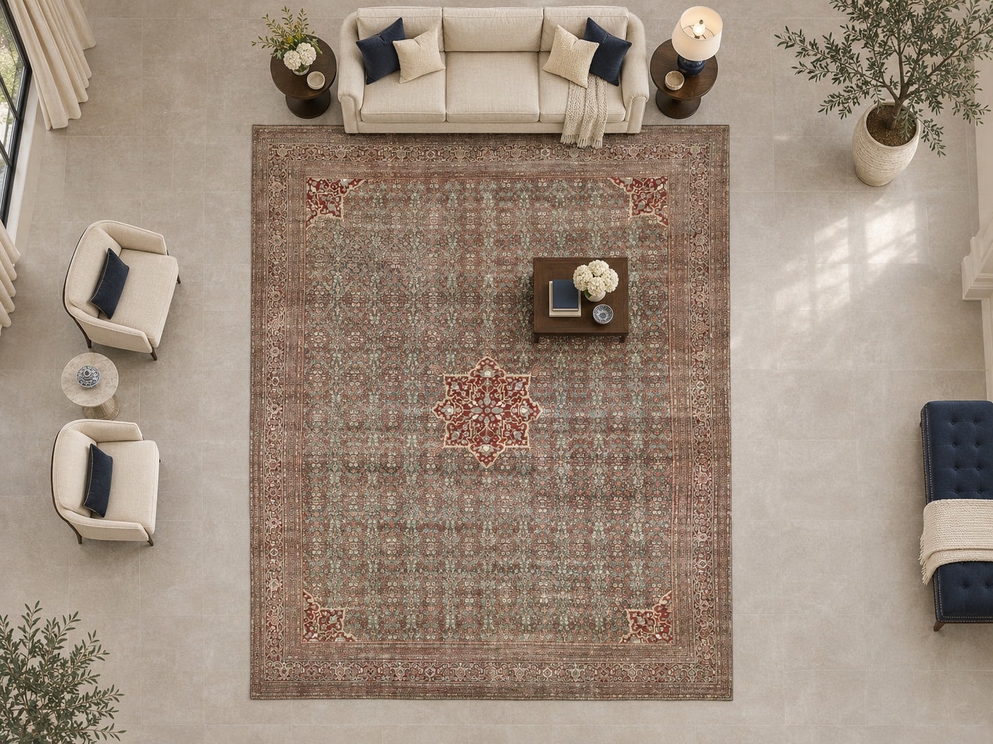
AI ROOM-STYLING CONCEPT · Regenerated using the catalog width–length proportions and a 7-foot sofa as a visual reference. Approximate visualization, not a real installation, exact reproduction or measured fit. See the scaled footprint below.
01 / PERSIAN / QUIETER FIELD, STRONGER CENTER
Homey Herati - Antique Persian Tabriz Area Rug – 12'0" x 14'1" ft.
The catalog describes an antique Persian Tabriz area rug at 12′0″ × 14′1″. In the original photograph, small repeated motifs merge into a relatively subdued blue-gray and taupe field. A red medallion and red corner accents stand out more clearly. The narrow brown-red framing is less emphatic than the center.
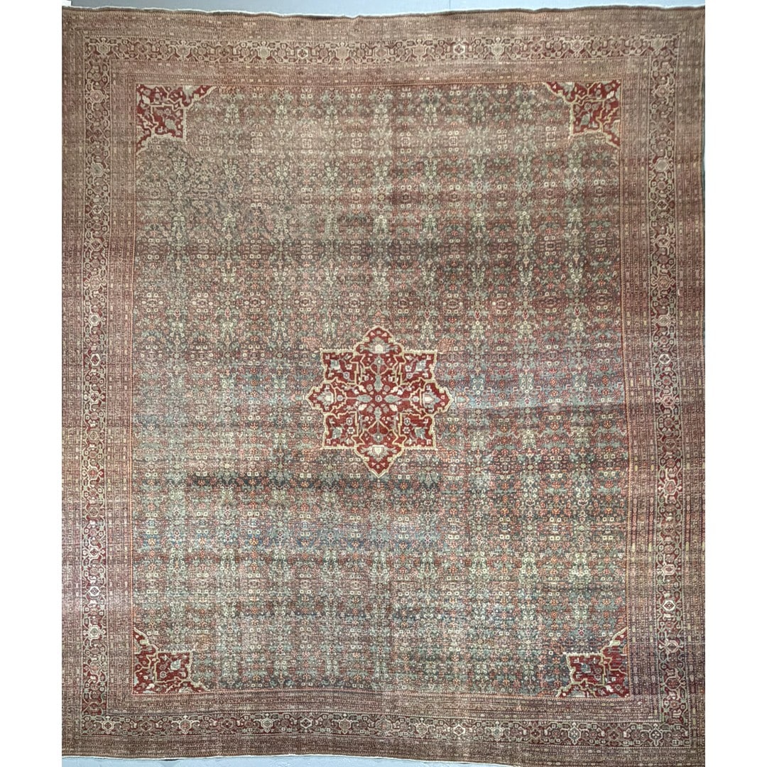
Original catalog reference. Use this view for the design observations; click either image for the exact listing.
Keep it if you want layered detail with a distinct center. Before choosing, ask what remains visible around your furniture: covering the red medallion could change the visual balance substantially. This is a relative reading of this image, not a measured contrast grade.
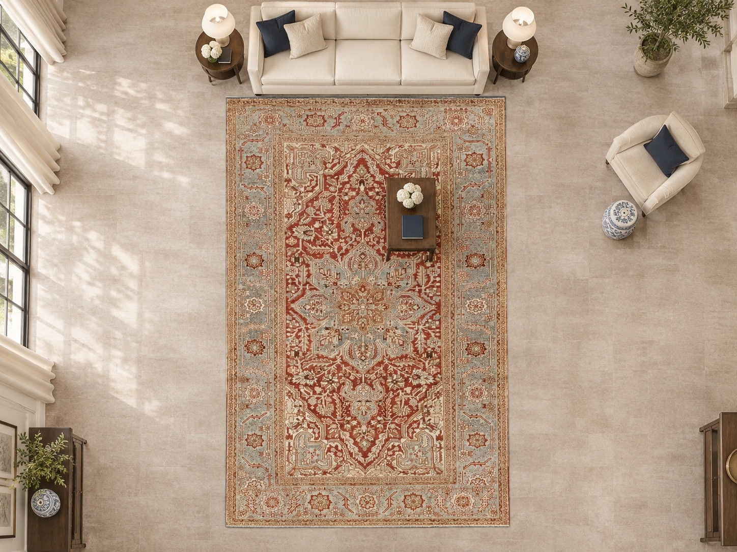
AI ROOM-STYLING CONCEPT · Regenerated using the catalog width–length proportions and a 7-foot sofa as a visual reference. Approximate visualization, not a real installation, exact reproduction or measured fit. See the scaled footprint below.
02 / PERSIAN / MORE DISTINCT FIELD–BORDER SEPARATION
Heritage Heriz – Antique Persian Wool Rug – 8'1" x 11'9" ft.
The catalog describes an antique Persian wool rug at 8′1″ × 11′9″. The original image shows a red field against a paler blue-gray border, with light angular motifs and a central medallion. Compared with Homey Herati’s quieter small-pattern field, larger light and red shapes remain easier to distinguish in this photograph.
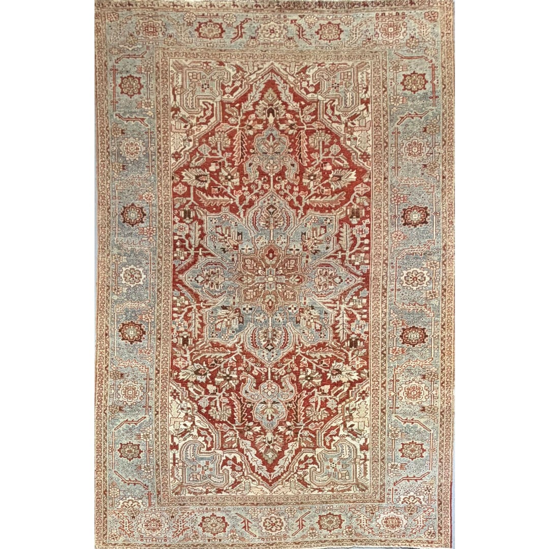
Original catalog reference. Use this view for the design observations; click either image for the exact listing.
Keep it if you want a clearly framed composition. Check the amount of pale border that will remain exposed beside the sofa. The examples differ in dimensions and photography; neither the images nor the room concepts establish a common physical scale.
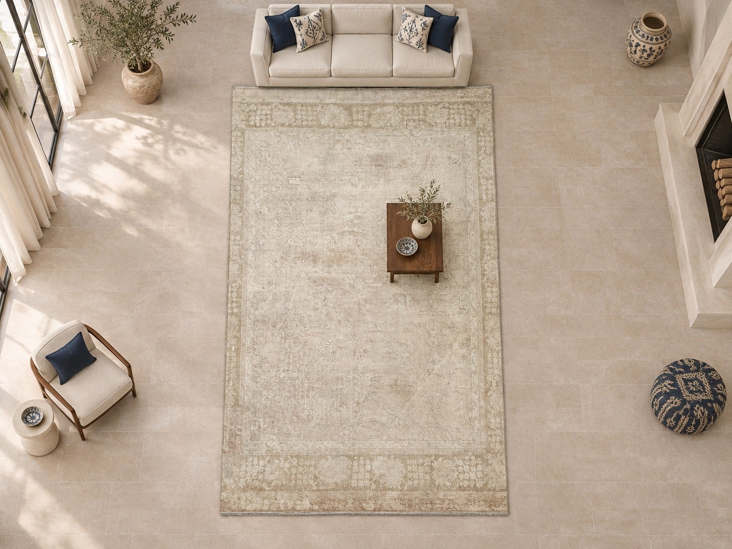
AI ROOM-STYLING CONCEPT · Regenerated using the catalog width–length proportions and a 7-foot sofa as a visual reference. Approximate visualization, not a real installation, exact reproduction or measured fit. See the scaled footprint below.
03 / TURKISH ALTERNATIVE / A GENTLER PALETTE
Authentic Anatolian – Antique Hand-Knotted Turkish Oushak Rug – 10’ x 16’4″ ft.
The catalog explicitly names an antique hand-knotted Turkish Oushak at 10′ × 16′4″. Its original view shows a pale field with comparatively subtle pattern and border separation. It offers a quieter visual direction to investigate alongside the two Persian listings. That observation is not a claim about every Turkish or Oushak rug.
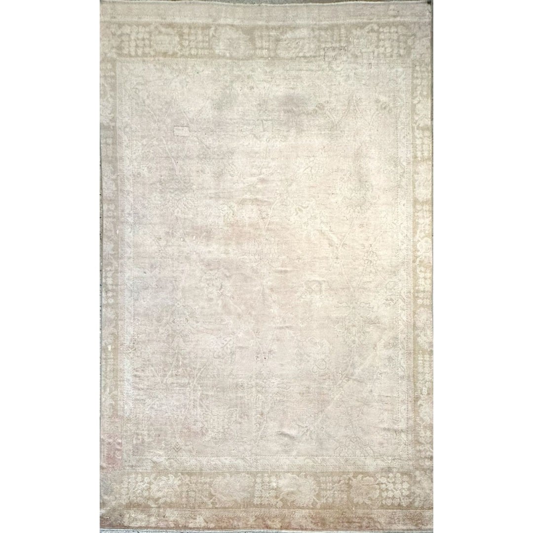
Original catalog reference. Use this view for the design observations; click either image for the exact listing.
Keep it as a palette alternative, then confirm the exact listing, dimensions and condition independently. A Turkish weaving attribution, an Oushak design label and a pale appearance are separate pieces of information; collection membership alone does not establish origin.
01 / A USEFUL VOCABULARY
Lightness.
Color.
Separation.
The National Gallery of Art defines value as a color’s lightness or darkness in its educational glossary. That is useful here because two different hues can have similar lightness, while two shades of one hue can separate strongly.
For a buying shortlist, use “lower contrast” to mean less apparent separation between the particular areas you are comparing, and “higher contrast” to mean more apparent separation. These are descriptive editorial terms, not industry grading categories. No numerical cutoff, certification or regional quality ranking is implied.
Field-to-border contrast is only one layer. A border can blend with the field while the central medallion remains conspicuous. The Met’s record for its Floral and Cloudband Carpet, attributed to Iran, specifically describes red and dark-blue ground colors helping distinguish border and field. That is an example of how composition works, not a rule governing every Persian rug.
02 / ROOM SWATCH LAB
Change the surroundings, not the rug.
The darker outline separates clearly.
The same outline separates less clearly.
EXPLICITLY SCHEMATIC · The two center blocks use identical CSS colors. These are invented room/rug swatches, not product samples, measured rooms or color predictions.
Consider the floor visible beside the rug, the sofa fabric, and nearby curtains before you decide how prominent the rug should be. Keep a small, consistent group of references rather than combining photographs taken under unrelated lighting. A floor or fabric sample beside the actual rug is more useful than trusting a monitor match.
If the furniture already has strong pattern, try a quieter field on the shortlist and check whether its border introduces another competing line. If the furniture is visually simple, include a clearly framed rug and decide whether you enjoy that emphasis. These are ways to compare preferences, not universal decorating rules.
03 / THE COMPARISON CARD
What should stay on your shortlist?
| Relationship | Lower-contrast direction | Higher-contrast direction | Question to settle |
|---|---|---|---|
| Field against border | The frame blends more closely with the central ground. | The perimeter reads as a more separate band. | Do you want the rug to make a visible frame around the furniture? |
| Motifs against field | Details may merge more readily at a distance. | Motifs can remain more distinct from their background. | Which parts will you see from the doorway and seated position? |
| Center against surroundings | A quiet center can share attention with the room. | A distinct medallion can become an obvious focal point. | Will your table or sofa cover the focal area? |
| Rug against floor | Similar lightness can make the outer edge less prominent. | A light–dark difference can make the outline more apparent. | Does the room need that boundary to stand out? |
| Photo evidence | A subtle image still needs clear, current views. | A bold image still needs clear, current views. | Have you compared photos consistently and confirmed the actual piece? |
Visual tendencies for comparison, not guaranteed effects. Pattern scale, the amount exposed and viewing conditions can change your preference.
04 / A THREE-CANDIDATE LIMIT
Give each candidate a job.
Keep one quieter option, one stronger option and one alternative that tests your assumption. For each, write a single sentence: “I want this rug to make the seating area feel framed,” or “I want texture and detail without a dominant border.” If you cannot explain the role, collecting more images may not help.
Record the stock number, actual dimensions, strongest visible area and the open question that could change your decision. Cross out a candidate only after the same checks. A pale photograph should not get a free pass on condition, and a striking pattern should not distract from a footprint that does not work.
05 / ASK FOR COMPARABLE EVIDENCE
Then verify the choice.
- Request a current full front view, border close-up and relevant condition details of the exact stock number.
- Ask the seller how the field and border read together in person. Explain the furniture and floor colors you are matching.
- Check measurements independently of color preference. Confirm which parts of the design your layout exposes.
- Before committing, clarify the current purchase terms directly; no return or trial policy is assumed here.
For the broader photo and condition request, use the antique-rug online buying checklist. For a related design comparison, see Oushak and Heriz pattern and border examples. This article stays focused on contrast rather than explaining abrash, fading or pile-direction effects.
Browse with a question in mind.
As you compare persian rugs for sale, save the exact listings and note whether you are judging the field, border or center. “Persian” does not tell you how quiet or emphatic an individual rug will look in your room.
Include turkish rugs for sale if you want another palette direction, using the same evidence checklist. A design name is not a substitute for a documented weaving attribution, and this comparison does not infer country of origin from a collection page.
The final question: “Does the part of this rug I will actually see create the amount of separation I want?” Answer it with the actual rug, your layout and consistent references.
Shortlist questions, answered
Is a low-contrast Persian rug always pale?
No. Contrast describes a relationship. Two dark areas can be close in lightness, and a pale ground can carry a sharply contrasting dark border.
Can one rug be both low contrast and high contrast?
Yes, when you specify different areas. Homey Herati’s reference has a relatively quiet small-pattern field with a more distinct red medallion. Say which relationship you mean.
Does high contrast mean better quality?
No. This is a visual comparison, not a construction, age, authenticity or condition grade.
Will low contrast make my room look larger?
No room-size effect is promised. Compare the actual visible footprint, surrounding floor and furniture rather than treating a palette as a guaranteed space-changing formula.
Can the generated room views prove the rug color or fit?
No. They are labelled styling concepts based on catalog references. They are not exact reproductions, real installations, color proofs or measured plans. Use original views and seller confirmation.
Should I choose the photograph with the boldest colors?
Choose the exact rug that meets your layout and preferences after consistent comparison. Different photographic conditions can change apparent separation. Request current views and confirm details in person when practical.